
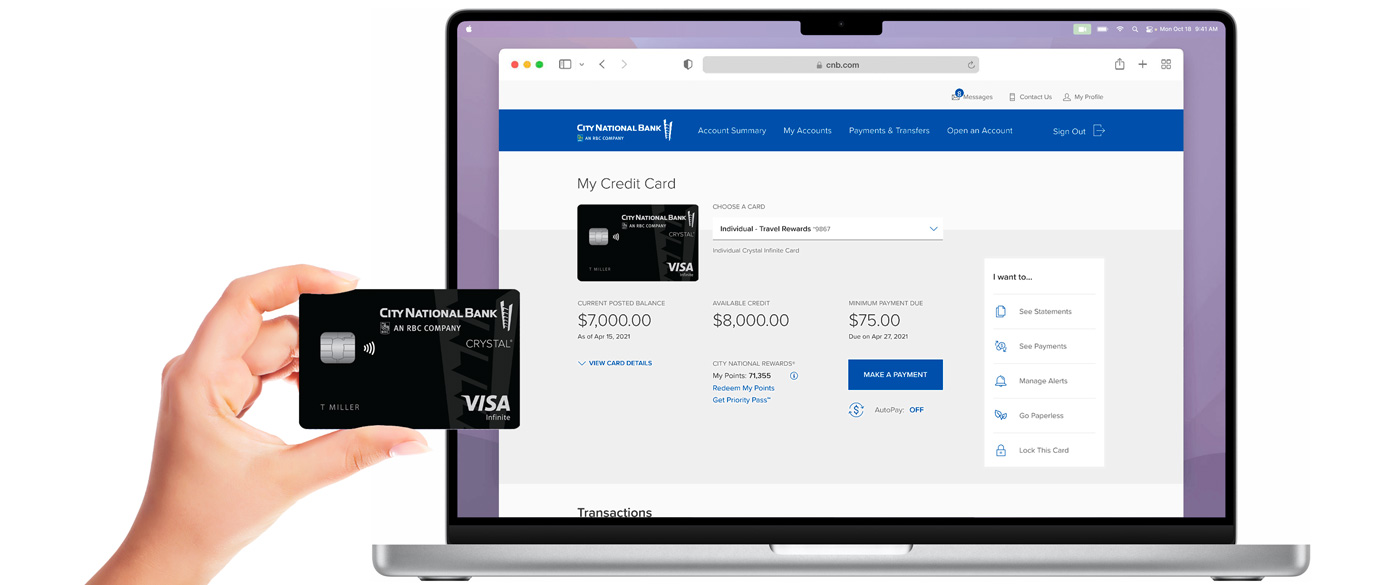
City National Bank Website: Credit Cards
Online Banking Website for Credit Card Experience
City National Bank, 2021
UX Design Concept Design
User Flows Site Mapping
WireframingPrototyping
UI Design

User research revealed that City National Bank's core user group – up-market, older users who primarily access this banking site via desktop computers – were accustomed to using the existing website despite it being dated and flawed. The challenge to the UX team was how to design an online banking experience that felt clean, modern, was responsive to multiple device formats, but also didn't alienate the existing user base.
Justin’s contributions included shaping user testing goals, simplifying the existing user flow site map, wireframing, designing and prototyping (in Figma), and co-establishing and implementing a UI style guide, all while incorporating findings from user research and testing.
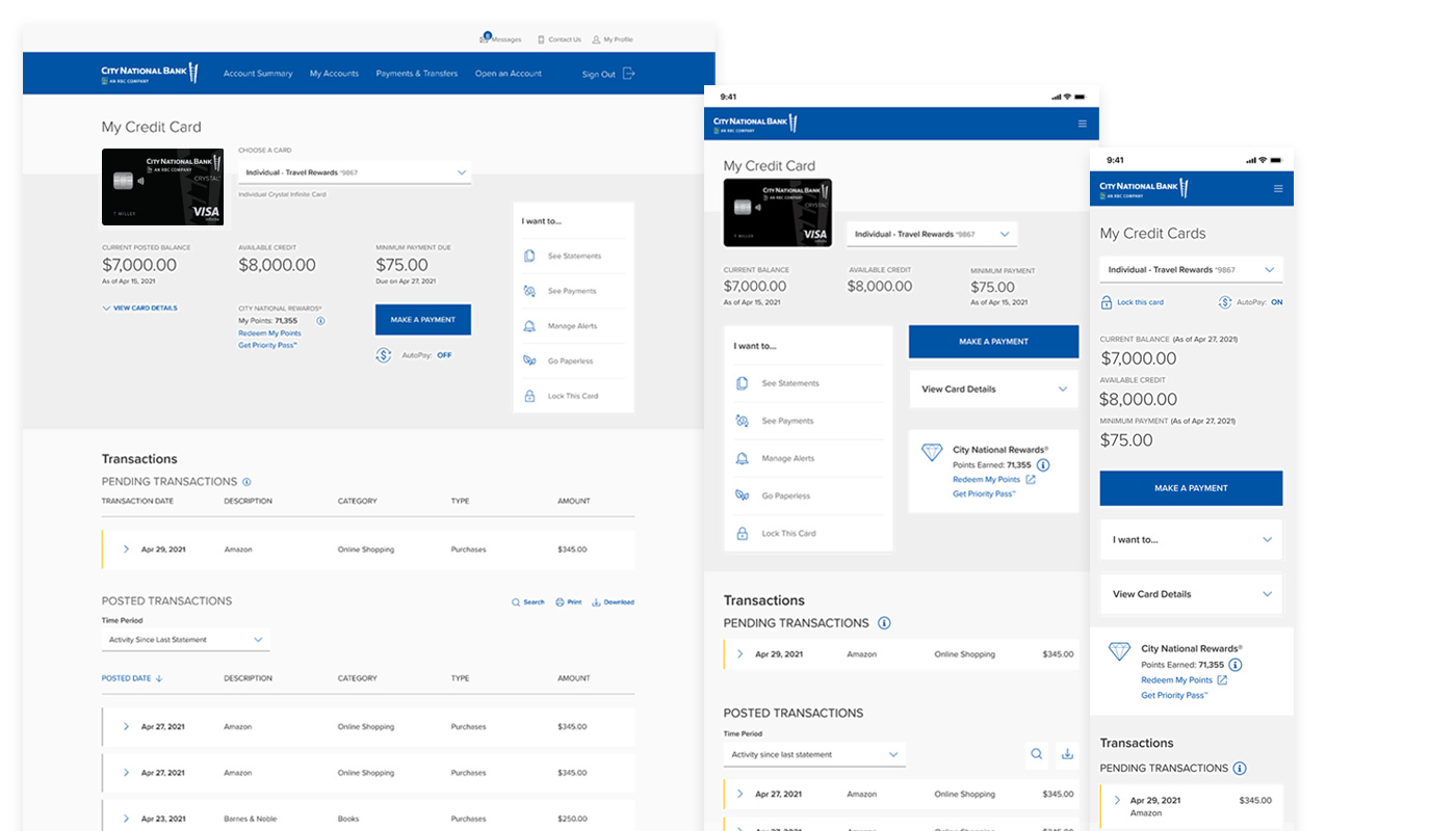
Credit card information that was previously distributed across two different screens is now consilidated into a single My Credit Card screen, in a site that is natively designed to work on desktop, tablet, and mobile.
Video excerpt of clickable Figma prototype (desktop format).
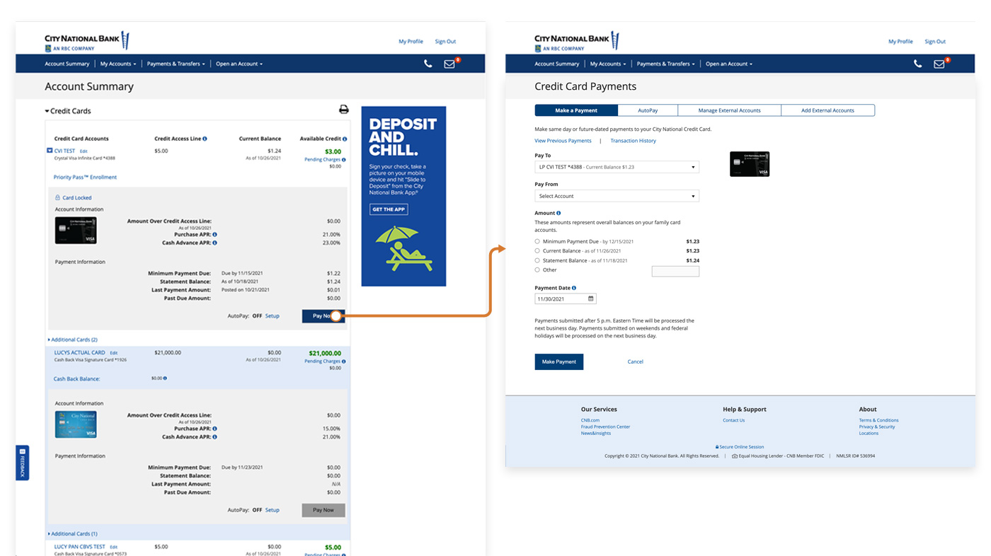
Previous/existing design using a dated legacy interface.
Which tasks, features, and types of information do users prioritize?
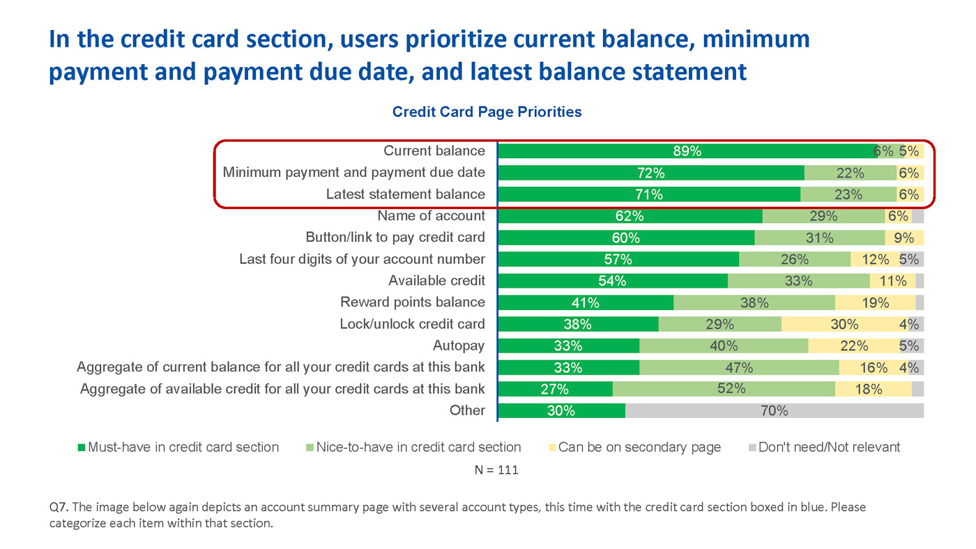
User testing by the City National Bank user testing team showed that credit card account holders prioritized these features and information points in the credit card experience.
How to simplify and smoothen the user flow for common credit card tasks incrementally, during a transitional period when the legacy back-end needs to remain partially in place?
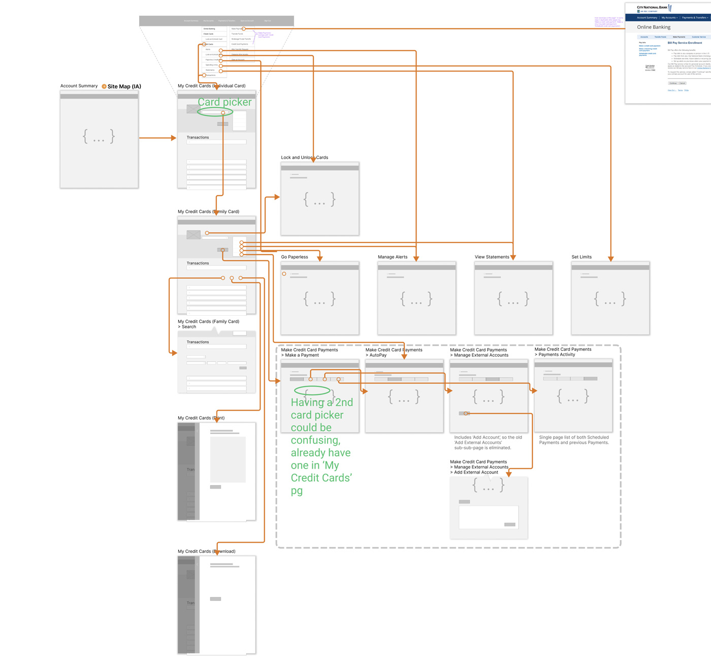
Wireframe user flow/IA diagram showing a new My Credit Cards screen temporarily integrating with a legacy credit card payment UX system (indicated inside the dash line box).
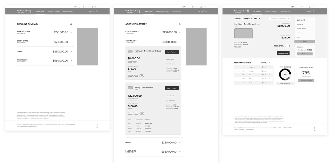
Prototype A in wireframes, showing screen design and flow from Account Summary to a new credit card landing page, which shows more information (in a quick, more abbreviated form) than the equivalent page in Prototype B.
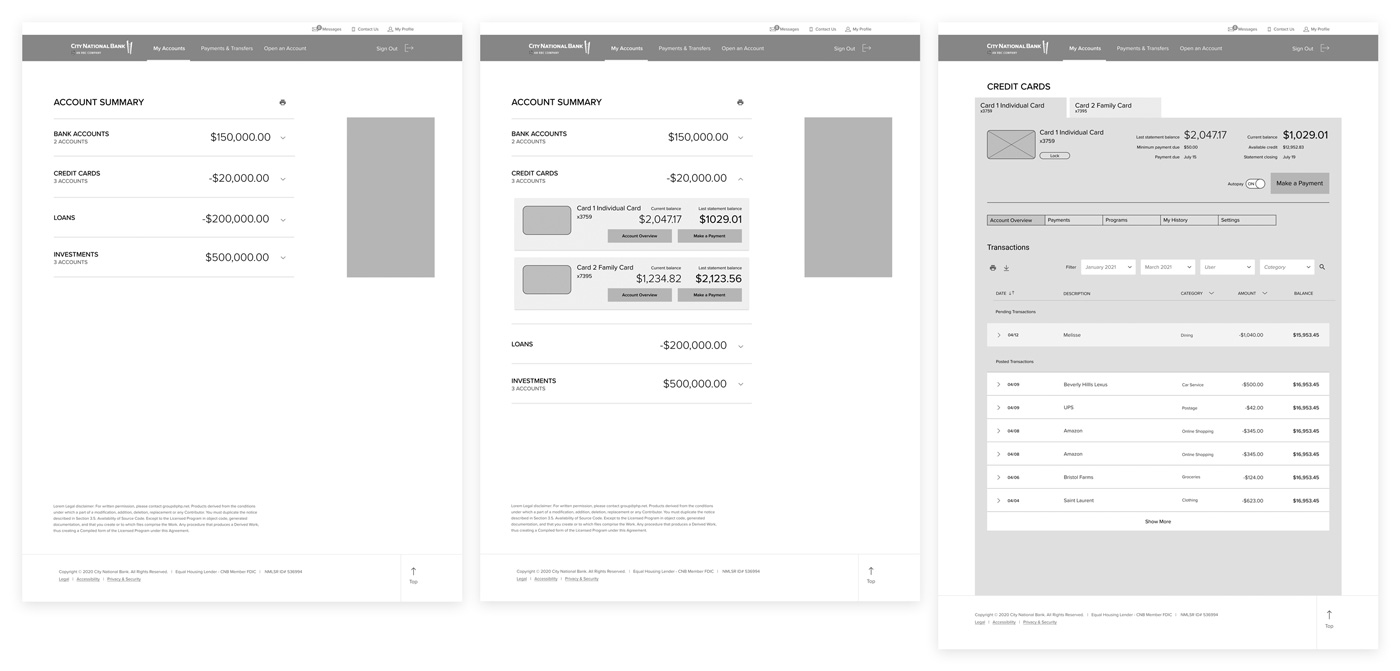
Prototype B in wireframes, showing screen design and flow from Account Summary to a new credit card landing page, featuring tabbed navigation between multiple credit cards.
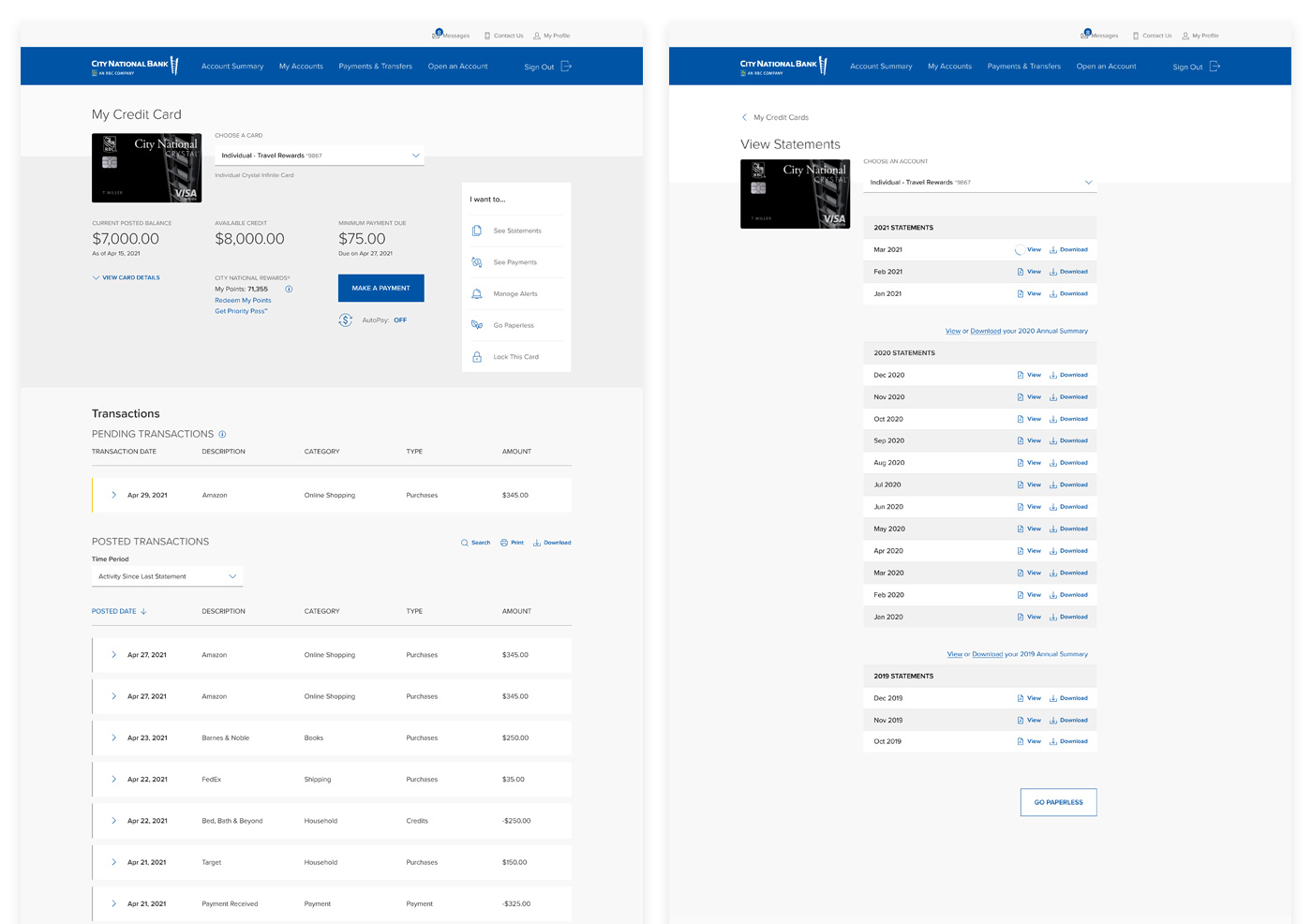
Final prototype design for My Credit Card and View Statements screens.
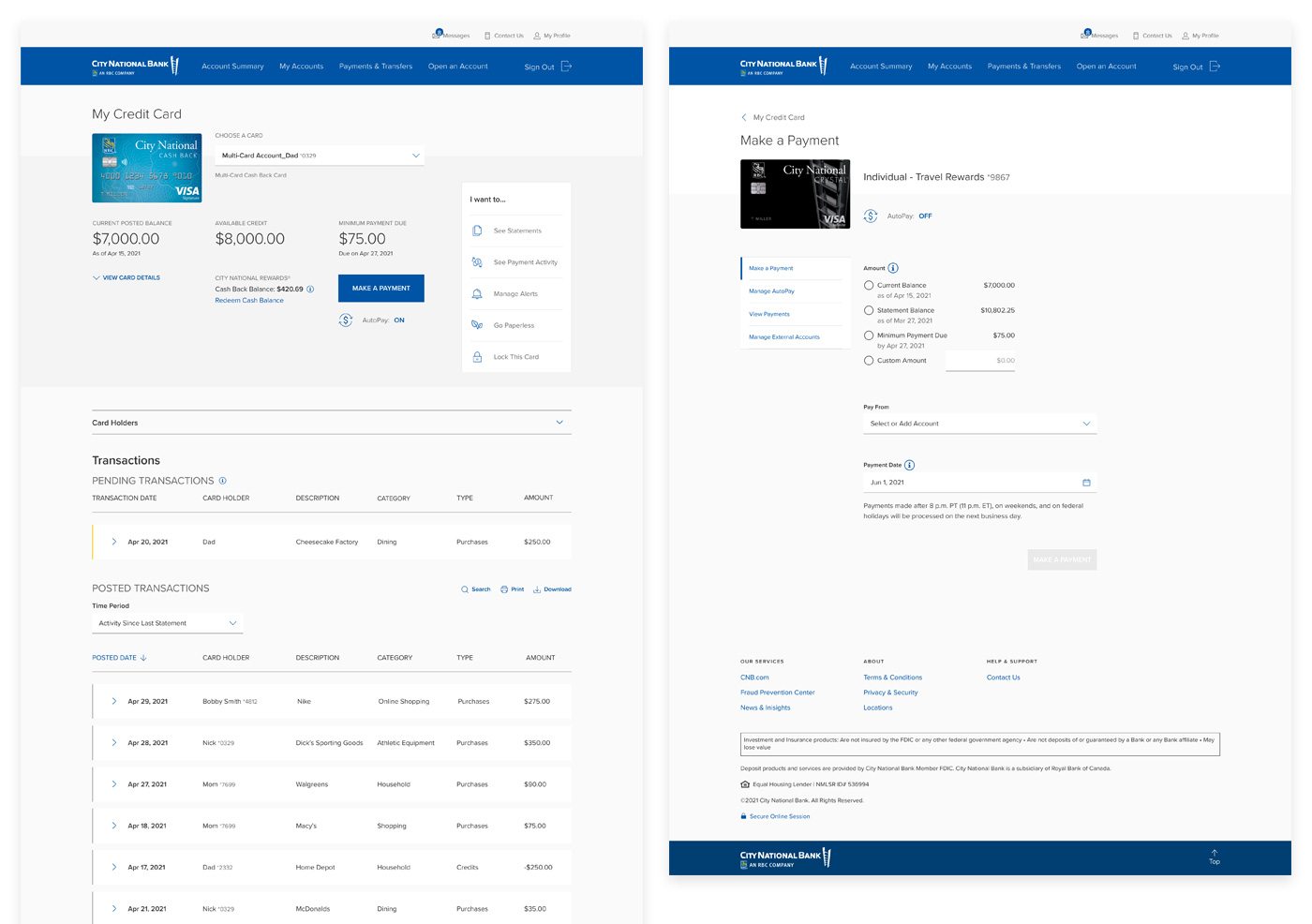
Final prototype design for My Credit Card and Make a Payment screens.
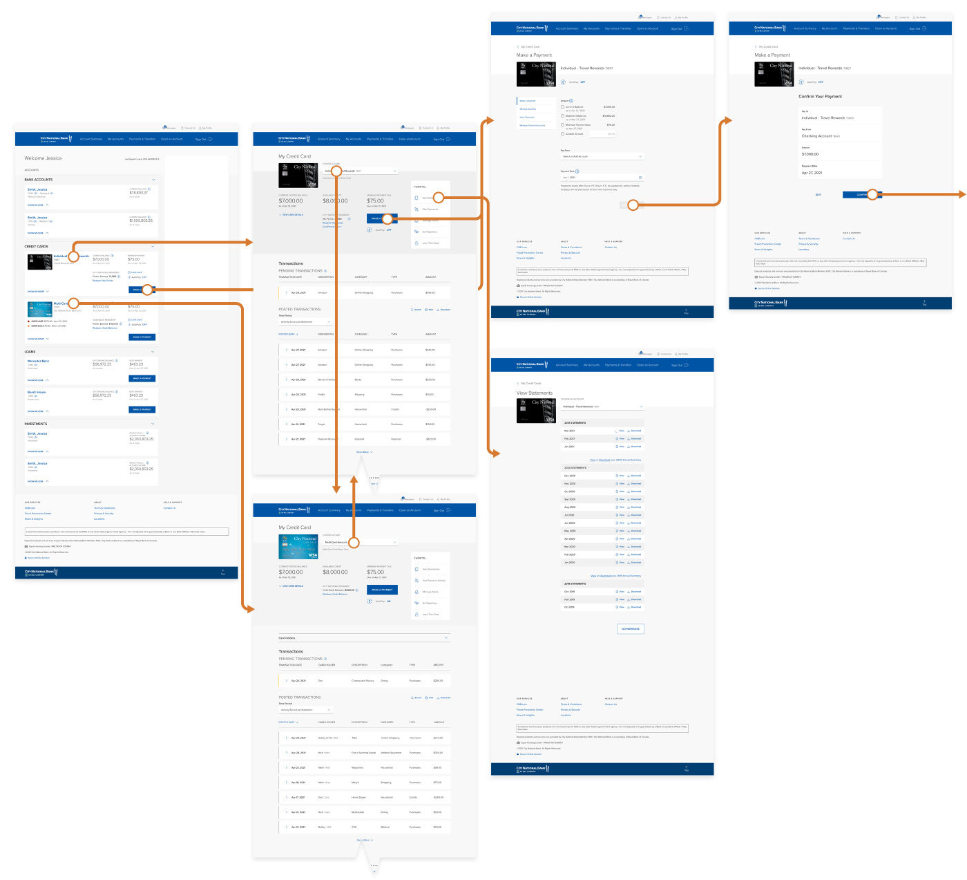
Final screen designs and user flow navigation from initial Account Summary screen to My Credit Card screen, to View Statements and Make a Payment screens.